
Vegas Golden Knights
Vegas Goes Gold With New Uniforms
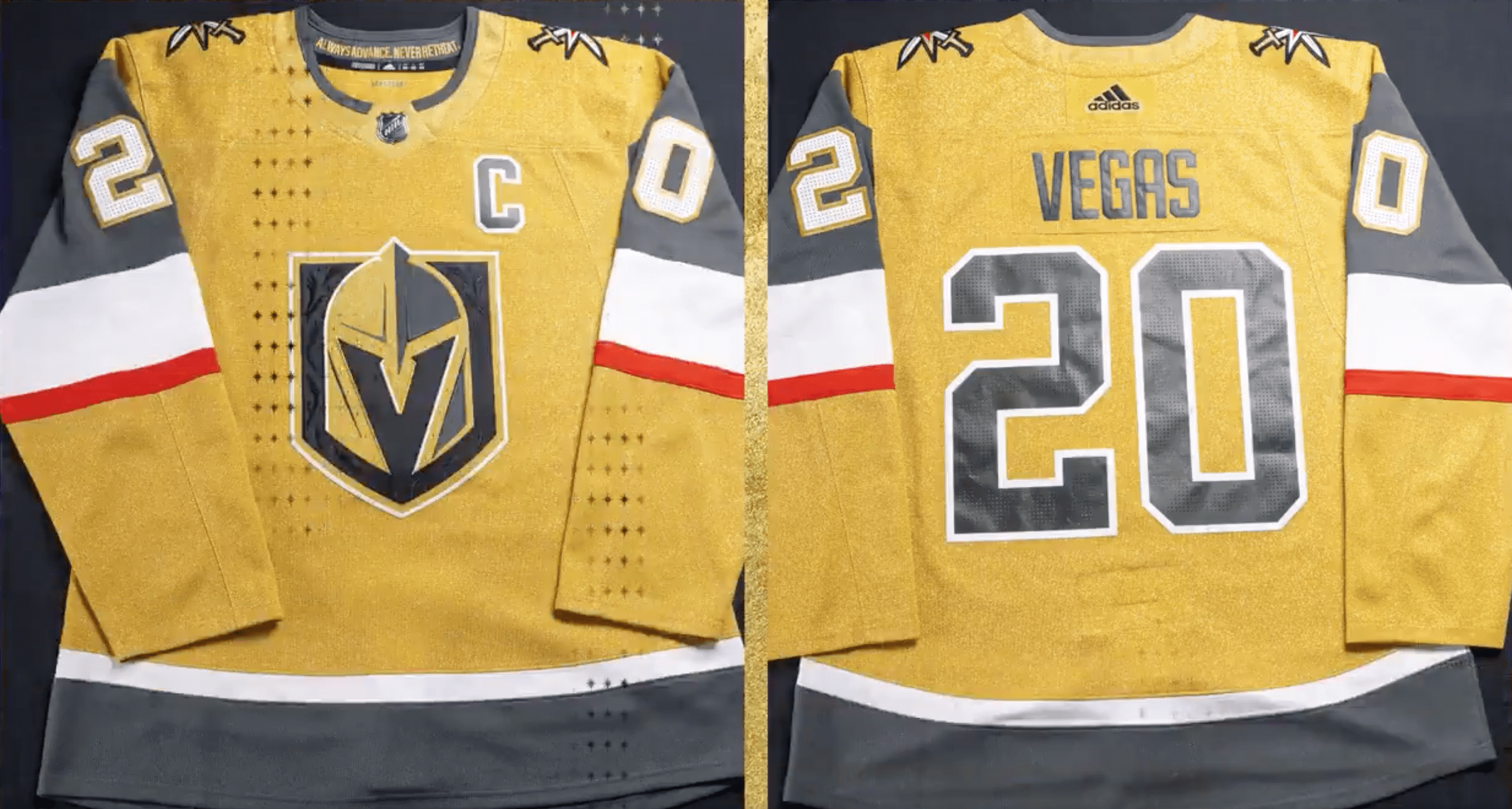
The Vegas Golden Knights unveiled new gold uniforms today with a music video featuring Wayne Newton and Lil Jon.
It was only a matter of time really.
There is also a better look at the jerseys in a video link posted towards the end of the article.
My first reaction is “well of course they did.” The team is the Golden Knights after all, and having gold jerseys makes sense. I’m primarily glad the gold on these jerseys is actually gold, and not yellow. That alone puts them ahead of the game when it comes to marketing and sales for the new threads.
As we take a deeper dive, note that I’m going to look at things from two angles. The first is as a fan who would buy the authentic jersey and wear it. The second is as a broadcaster who has seen a million jerseys both good and bad, and provide you with a little insight into what your favorite commentators experience when they call games.
Overall Design
Not much has changed here really. The piping and striping is the same as the current duo of jerseys so no real leaps there. The primary logo remains, as does the font and numbering. The subtle details that made this jersey such a delight when we first saw it remain on the sleeves and logo. Rounding out the look, the white gloves with gold accents return with black pants and gold socks. The dark helmets go well with this look.
Crest
Ok, I feel like this was a missed opportunity to showcase the secondary logo. While it’s possible Vegas has some fan research showing them reason to put the primary crest on the jersey, I would have went for the current shoulder patch as the primary. It’s a nice look that incorporates both the crossed swords for a knight but also evokes the famous Welcome Sign that have become so iconic to the city. It doesn’t look bad as is, but I would have loved to see them showcase it here. It would have popped nicely against the gold.

Numbering and Lettering
Thank you Vegas and Adidas for sticking with a high-contrast dark on light look They were not tempted to go white-on-gold, although I would have loved to see a mockup with red numbers outlined in the dark grey. I would not put the names in red, those would stay as is. The darker the color against a light contrast, the easier it is to see for someone perched up way high in booth. What also stinks is alternate, hard to read fonts for letters and numbers (I’m looking at you Colorado and Tampa). It also helps for fan identification when a four does not look like a nine and so forth. Here’s one other small thing I really like is keeping the shoulder numbers as light-over-dark. It gives an instant indicator of where to look for the numbers and makes it much easier to read. Also, the subtle white outline between number and jersey provides another contrast to make things easier to sort out.
Details
I’ve always loved the details on the Vegas Golden Knights jerseys. When I was with Nashville I remember the details that came with the new look – piano keys inside the collar, other small touches to make them unique. When Vegas unveiled its original jerseys, they took it up a notch. Stitched stripe and logo details. Perforated numbers for texture to match the dimpled shoulders. As Vegas goes gold, the collar carries the Always Advance, Never Retreat motto. For those who don’t know, owner Bill Foley has always said knights always advance, never retreat. Even the gold fabric of the jersey has a woven texture to it. All of these details are not something you see on TV. You see them when you hold it. When you put it on. Players and fans alike will love the design up close.

An up close look at some of the stitching on the new Vegas Golden Knights gold jersey.


Overall Impressions
What will sell this jersey on the players and fans is the overall care put into its design. If you were looking for something new and dramatic, this isn’t it. The color was the next logical step in the jersey chain. No major risks were taken. That said, getting it right is really important and kudos to Vegas on the execution of a third jersey color that checks all the boxes for current fans. These will sell really well, and I wouldn’t be surprised to see them trotted out fairly often.
Interesting Note
Teams that wear yellow jerseys have a problem: in black and white newspaper photographs, you can’t tell yellow from white jerseys. They both show up white. While this is less and less of a concern every day, I wonder if the slightly darker gold color of these jerseys would at least show grey in your typical newspaper photo.
Here’s the VGK tweet with the full jersey reveal video. Let us know what you think about them in the comments!
Here it is in all its Golden glory 😍 #VegasGoesGold pic.twitter.com/Ijram8lT8J
— Vegas Golden Knights (@GoldenKnights) October 2, 2020


Golden Knights vs. Stars Game 5 Preview: Vegas Switching Goalies

Golden Knights New Blood Not Pulsing

Golden Knights Squander Advantage Back to Stars

Golden Knights vs. Stars Game 4 Preview: Mantha Scratched

Thompson Proving Golden Knights Made Correct Goalie Choice

Golden Knights Coach: ‘(We need) To Be A Lot Better Monday’

Golden Knights Offer How-to Playoff Guide in Game 2 Win

Golden Knights vs. Stars Game 3 Preview: Hague Still Out

Golden Knights Notebook: Martinez Steps In For Injured Hague