
Opinion
Ranking All 5 Golden Knights Jerseys
The Vegas Golden Knights are a young NHL franchise, so their jersey history is not very expansive. With their 6-2 win over Washington Capitals…
The Vegas Golden Knights are a young NHL franchise, so their jersey history is not very expansive. With their 6-2 win over Washington Capitals Saturday night, the VGK have now officially played every reverse retro scheduled game for 2022-23. This gives the team five jerseys in its six-year history.
We've surprisingly never done this here at Vegas Hockey Now, and as our EIC rests up after a lot of driving yesterday, here's our picks for the top VGK jerseys.
Ranking Vegas Golden Knights Jerseys
5) Red Reverse Retros
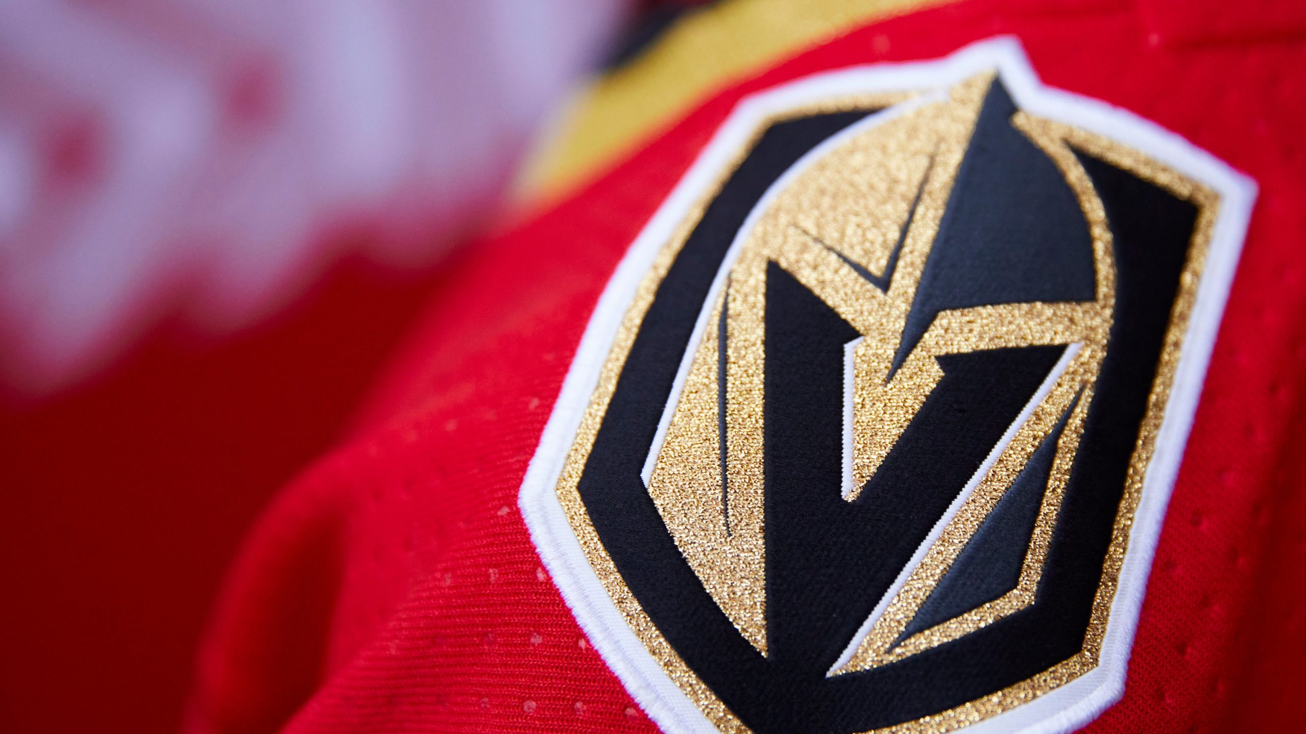
Worn both in the 2021 Lake Tahoe game against the Colorado Avalanche and also as reverse retro jerseys, the red jerseys were fine, but not the best. Before we go any further, I think the Golden Knights have five great jerseys, and none of them are bad. But one of them has to come in last.
Red has been incorporated into every Golden Knights jersey to represent Red Rocks Canyon. This jersey allowed it to shine as the primary color for the first time, and as a result, it just doesn't feel like a Golden Knights jersey.
The sword and Welcome to Las Vegas Sign-themed logo takes over as the main logo on the crest, and it looks great. The Golden Knights have an amazing secondary logo that captures both the team name and where they are from. I hope we see it as the primary logo in another jersey soon.
Lastly, the striping is a tribute to the Las Vegas Thunder, an international hockey league team that played in vegas in the 1990s. Nice touch.
Overall strong jerseys, but the red is not very golden- literally.

Alec Martinez and Marc-Andre Fleury (Photo- Vegas Golden Knights via Twitter)
4) Glow In The Dark Retros
The design team has done a great job working with what they have, considering the youth of the Golden Knights franchise and that they can't just pull a jersey from the team's 1990s history and reverse the colors. They had to get creative and did so by using fonts from famous Las Vegas hotel signs, such as the Excalibur for the Vegas wordmark logo and the former Stardust hotel for the numbers.
These are the first black jerseys in VGK history and glow-in-the-dark in pure black light surroundings. Unfortunately, outside of the video on the jumbotron of the players walking through a blacklight tunnel, it is hard to really notice the glow-in-the-dark effect on the ice in the pregame.
I hate advertisements on jerseys, but they found a good spot to put the Circa Sports patch, on the shoulder opposite the secondary_ logo.
I strongly dislike wordmark logos and think they are unoriginal, boring, and only acceptable for the New York Rangers. Now that they are gone, I can't say I will miss these jerseys much.

Vegas Golden Knights 2022-23 reverse retro jerseys, (Photo- Vegas Golden Knights via Twitter)
3) Road White Jerseys
There's not much to talk about here with the Golden Knight's road jerseys. They do everything road jerseys are supposed to and are solid. It's basically the team's standard gray home jerseys but adjusted so that white is the main color.
Love the Golden Knight's main logo, as long as it remains gold and black and doesn't turn gray. The secondary logo on the shoulder is great, and so are the nameplates and jersey numbers.
The thing that still continues to bug me about every Golden Knight jersey is the red. I understand they want to make the Red Rocks connection, but it doesn't mesh well with the other colors, in my opinion.
")
Vegas Golden Knights, (Photo- Vegas Golden Knights via Twitter)
2) Gray Home Jerseys
I'm aware these are the consensus best jerseys in Golden Knights history to many, but not for me. They're great, and everything I said about the road white jerseys basically applies here. Great logos, nameplates, lettering, and striping.
But I still don't like the red and also don't think gray should be the primary color for this team, which means…
")
Vegas Golden Knights (Photo- Vegas Golden Knights via Twitter)
1) Gold Jerseys
Call me crazy, but they are the Vegas Golden Knights, after all. I say embrace it, and love how the team is with the whole "Golden Age" thing. These jerseys suffer from the same problems as the previous two with the red, but make up for it by actually being gold.
They get the unfortunate eye sore, having the Circa Sports logo patch, but I won't knock them for that.
These are overall the best VGK jerseys in team history, IMO, and I'm aware this opinion isn't a popular one.

William Carrier, Vegas Golden Knights (Photo- Vegas Golden Knights via Twitter)


Golden Knights Notebook: Martinez Steps In For Injured Hague

Golden Knights Offer How-to Playoff Guide in Game 2 Win

Golden Knights First to do This in Expansion Era

Golden Knights vs. Stars Game 2: Lines, Notes & How to Watch

Golden Knights Unconcerned By Low Shot Count

Are Golden Knights Better Off Facing Stars Over Oilers?

Golden Knights Are Making A Different Playoff Climb

Golden Knights Use LTIR To Their Full Advantage

Who Starts for Golden Knights? Thompson vs. Hill
